Salone del Mobile 2025 and the colors shaping new furniture
Salone del Mobile 2025 presented color as a central part of furniture design rather than a finishing touch. Across seating, tables, storage, lighting, and outdoor collections, designers used color to establish mood, communicate material character, and make familiar forms feel newly relevant. The strongest launches moved beyond the safe neutral showroom, although soft, adaptable tones remained essential to many collections. Learn more about Arper S New Stackable Chair Is Made Entirely From Fishing Net Waste.
The palette emerging from Milan was broad but coherent. Warm mineral shades, softened greens, deep reds, saturated blues, and pale yellow appeared beside oak, walnut, stone, brushed metal, and recycled materials. Instead of treating color as a single seasonal trend, brands built layered combinations that could work in residential interiors, hospitality spaces, offices, and outdoor rooms.
This approach reflects a wider shift in the international design industry. Furniture is being asked to create emotional comfort, support flexible use, and show a clearer relationship with responsible production. At the fair, color often helped express those ambitions by making recycled plastics look appealing, giving technical fabrics a tactile presence, or adding warmth to highly functional pieces.
Warm neutrals move beyond beige
Beige remained visible throughout the Milan furniture fair, but the most interesting neutrals had more depth than the pale sand tones that dominated earlier interiors. Designers favored clay, putty, biscuit, mushroom, caramel, and tobacco. These colors brought a subtle earthiness to upholstery and lacquered surfaces while avoiding the flatness of conventional cream.
Warm neutrals also appeared in combinations rather than isolated blocks. A cinnamon-colored sofa could be paired with a pale stone table and dark brown wood, while a taupe chair might sit beside a muted terracotta lamp. The result was an interior palette that felt calm but still layered, with tonal contrast supplied by texture, shadow, and material transitions.
This preference suits the current demand for furniture that can move between design styles. A caramel lounge chair can support a contemporary apartment, a mid-century-inspired scheme, or a more rustic room. The color is distinctive enough to add character, yet restrained enough to remain useful when other furnishings change.
Greens connect interiors with the natural world
Green was among the most versatile hues across new furniture collections. Soft sage and eucalyptus tones appeared on upholstery and outdoor pieces, while olive, moss, and forest green provided stronger visual weight. These shades connected indoor furniture with gardens, courtyards, and balconies, supporting the broader movement toward biophilic and nature-led interiors.
The most successful greens were slightly complex rather than highly artificial. Grey undertones made sage feel architectural, yellow undertones gave olive a warmer presence, and blue-green shades created a cooler, more refined effect. Designers used these variations to distinguish quiet lounge furniture from more expressive dining chairs, shelving, and accessories.
Green also worked well with natural materials. Against pale ash or oak, it produced a light Scandinavian feeling; beside walnut, it became richer and more intimate. Paired with travertine, brushed brass, or warm terrazzo, it suggested a sophisticated hospitality environment. In outdoor furniture, darker greens helped collections sit comfortably among planting without disappearing completely.
Yellow, blue, and red provide controlled energy
Pale yellow emerged as one of the gentlest accents in the 2025 palette. Butter, straw, vanilla, and faded saffron appeared in chairs, cushions, lamps, and small storage pieces. These colors brought light into interiors without the sharpness of primary yellow, making them suitable for rooms that need optimism without visual overload.
Blue offered a wider range of expression. Powder blue and dusty denim supported quiet, residential spaces, while cobalt, ultramarine, and ink introduced a more graphic character. Deep blue was particularly effective on compact furniture, where a saturated finish could create a focal point without overwhelming the whole room.
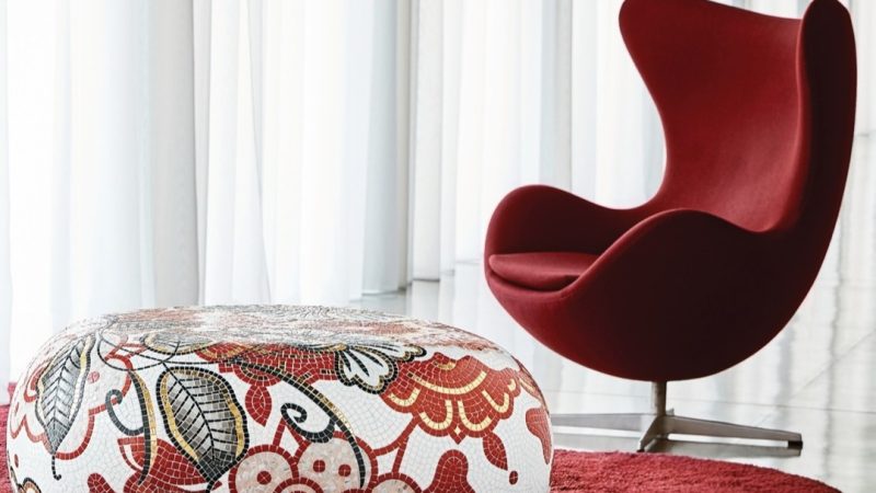
Red appeared in a similarly edited way. Rather than covering entire interiors in bright scarlet, designers explored brick, oxblood, burgundy, rust, and paprika. These shades gave sofas, dining chairs, and occasional tables a sense of warmth and permanence. They also reinforced the return of 1970s-inspired forms, including generous cushions, rounded corners, and low, sculptural profiles.
| Color family |
Typical shades |
Design effect |
Useful pairings |
| Warm neutral |
Putty, biscuit, caramel, tobacco |
Grounded and adaptable |
Oak, walnut, stone |
| Soft green |
Sage, eucalyptus, olive |
Natural and calming |
Linen, terrazzo, pale wood |
| Deep green |
Moss, forest, petrol |
Intimate and substantial |
Brass, dark wood, leather |
| Soft yellow |
Butter, straw, vanilla |
Bright but gentle |
Cream, clay, light blue |
| Strong blue |
Cobalt, ultramarine, ink |
Graphic and confident |
White, silver, warm brown |
| Earth red |
Terracotta, paprika, burgundy |
Warm and expressive |
Travertine, black, beige |
| Dark neutral |
Chocolate, charcoal, near-black |
Dramatic and anchoring |
Textured fabrics, metal |
Material finishes make color more tactile
The furniture launches at Salone del Mobile showed that color cannot be separated from surface treatment. The same green reads differently on a matte powder-coated frame, a plush boucle, a transparent glass panel, or a high-gloss lacquer. Brands used finish, grain, and reflectivity to make familiar hues feel more specific and dimensional.
Matte surfaces continued to support the calm, understated side of the palette. They softened strong colors and helped furniture integrate into domestic interiors. Gloss and translucency created a different effect, particularly on compact occasional tables, lighting, and storage. These finishes caught changing daylight and made color appear to shift as people moved through a room.
Textiles were especially important in expanding the range of neutrals and accent tones. Boucle, brushed wool, ribbed fabric, and recycled polyester gave pale shades a tactile richness, while leather and coated textiles intensified darker reds, greens, and browns. In many cases, the color was designed to be experienced through touch as much as sight.
Sustainability also influenced how color was presented. Recycled content, repairable components, and material transparency were increasingly visible in product storytelling. Arper’s recycled chair, made entirely from fishing-net waste, shows how responsible material development can become part of a product’s visual identity rather than remaining hidden behind the finished form.
Furniture collections embrace tonal layering
One of the clearest directions in Milan was the move toward coordinated tonal families. A collection might include several shades of clay, a progression from pale sage to deep green, or upholstery colors that shift from sand to caramel. This gave architects and interior designers greater control when specifying furniture across a large project.
Tonal layering is particularly useful in hospitality and workplace design. A hotel can use a darker color in a high-traffic lobby, a mid-tone in a lounge, and a lighter variation in bedrooms while maintaining a recognizable visual language. Offices can apply saturated colors to collaborative zones and quieter neutrals to focus areas without creating a disconnected environment.
Residential furniture benefited from the same flexibility. Modular sofas, dining chairs, side tables, and storage units increasingly allow different colors to be combined within one system. Rather than committing to a single statement shade, users can create a gradual composition that feels personal and can evolve over time.
This makes the 2025 palette less about selecting a fashionable color and more about building relationships between hues. A room may rely on a neutral base, introduce green through seating, add a blue accessory, and use terracotta in artwork or lighting. The effect is expressive without becoming visually crowded.
Outdoor color becomes more architectural
Outdoor furniture collections also moved beyond basic black, white, and grey. Terracotta, olive, muted yellow, and mineral blue appeared on powder-coated aluminum, woven materials, and weather-resistant textiles. These colors helped outdoor pieces feel like a continuation of the interior rather than temporary equipment placed on a terrace.
The strongest outdoor palettes balanced visibility with environmental integration. Dark green and brown could blend with planting and timber, while rust and warm yellow added a deliberate architectural accent against concrete or pale stone. Blue introduced a cooler counterpoint around pools, coastal homes, and contemporary urban terraces.
Durability remained a key consideration. Exterior color must withstand sunlight, moisture, and repeated use, so finishes were often selected for both visual depth and long-term performance. This explains the popularity of mineral and muted tones: they provide personality while aging more gracefully than extremely bright pigments.
For designers planning a complete property, the shared palette between indoor and outdoor collections offers useful continuity. A clay-colored dining chair inside can be echoed by a terracotta side table outside, while a sage interior textile can relate to green powder-coated frames on a balcony.
Practical ways to use the Milan palette
The color direction from Salone del Mobile 2025 is flexible enough for both quiet rooms and expressive schemes. A successful interior does not need every prominent hue. It needs a clear base, one or two supporting colors, and enough material variation to prevent the arrangement from feeling flat.
These recommendations translate the trade-show mood into choices for residential and commercial projects:
- Start with a warm neutral foundation such as putty, mushroom, sand, or tobacco.
- Use green when the room needs a natural connection, choosing sage for softness and olive or forest for depth.
- Add a controlled accent in butter yellow, cobalt, terracotta, or burgundy through one major furniture piece or several smaller objects.
- Balance saturated upholstery with tactile natural materials including wood, stone, wool, linen, or textured ceramic.
- Repeat one color across different finishes so the scheme feels intentional rather than matched.
The most durable approach is to invest in color where replacement is easy and commitment is manageable. An accent chair, ottoman, lamp, or occasional table can carry a stronger shade than a large sofa. Larger upholstered pieces work well in clay, caramel, olive, or deep blue, especially when their form is simple and their fabric has visible texture.
For commercial interiors, color coding can also improve navigation. A particular green may identify a lounge area, while blue marks meeting spaces and warm yellow signals informal collaboration zones. The palette then supports the experience of the building as well as its visual identity.
Carry the palette into everyday spaces
The Milan launches suggest that furniture color is becoming more considered, material-aware, and adaptable. Warm neutrals provide longevity, greens create a relationship with nature, and carefully chosen accents bring energy without turning a room into a short-lived trend. The appeal lies in the balance between emotional color and practical specification.
To bring this direction into a home, workplace, hotel, or outdoor setting, begin with the atmosphere the space should create. Then select furniture whose color, texture, and construction reinforce that mood. Explore the latest collections from international brands, compare finishes in natural light, and build a palette that can develop across rooms and seasons.